In 2021 Camden Town Brewery set a competition to design a new bar font (draught beer dispensing device, not 'typeface') for their best-selling beer, Hells Lager.
The Creative Brief outlined by Camden Town Brewery:
Camden Town Brewery expressed in their presentation a desire to make an impact in the bar environment with a new and original font design, this element was the only one in their distinctive and considered visual language, that they felt had thus far failed to promote their characteristic brand identity.
The font would have to aid in their desire to change perceptions of Hells as a craft beer particularly outside of London where fewer drinkers were aware of the brand, and establish it firmly as a ‘super premium’ trade-up option to the likes of Peroni, Estrella and Carlsberg Export.
It would also have to be part of a strategy to make the experience of purchasing a pint of Hells better than its competitors, and be a pleasure for bartenders to use.
Camden Town Brewery - Hells LAB Bar Font
Design: George Podoski
Visualisation: George Podoski
Software: Autodesk 3D Studio Max, Adobe Photoshop, Adobe Illustrator, Adobe InDesign, Adobe Premiere, Adobe After Effects
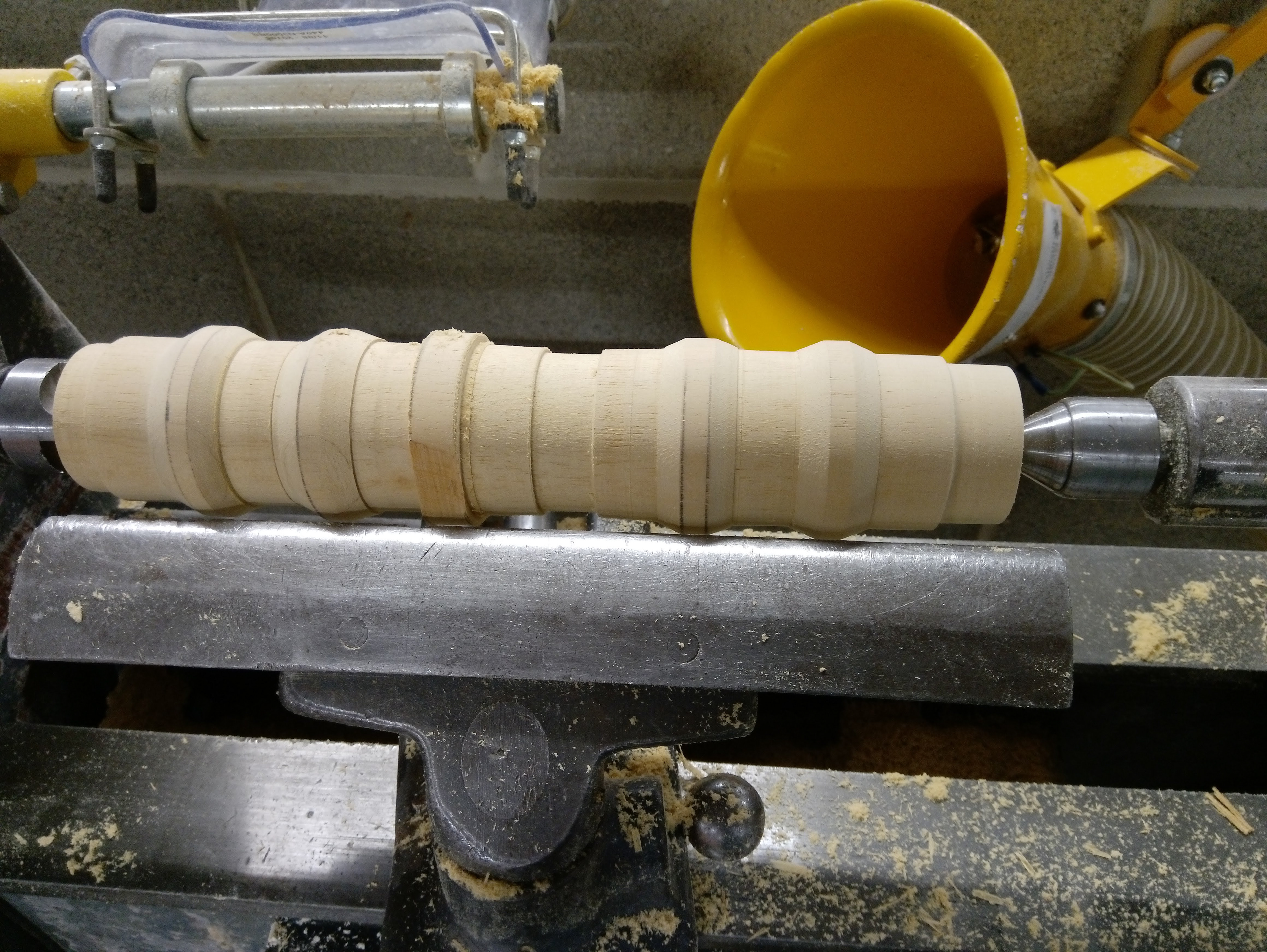
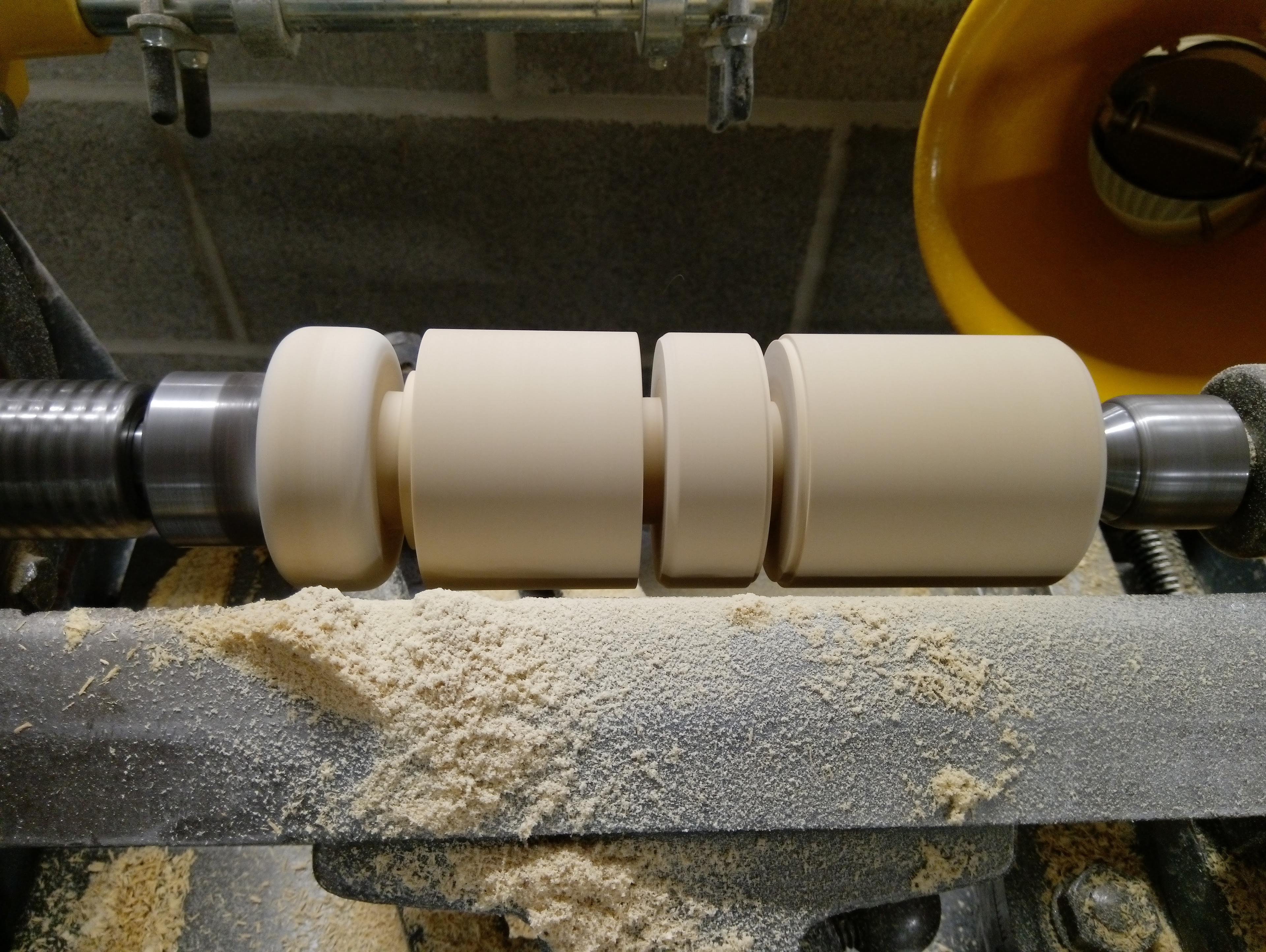
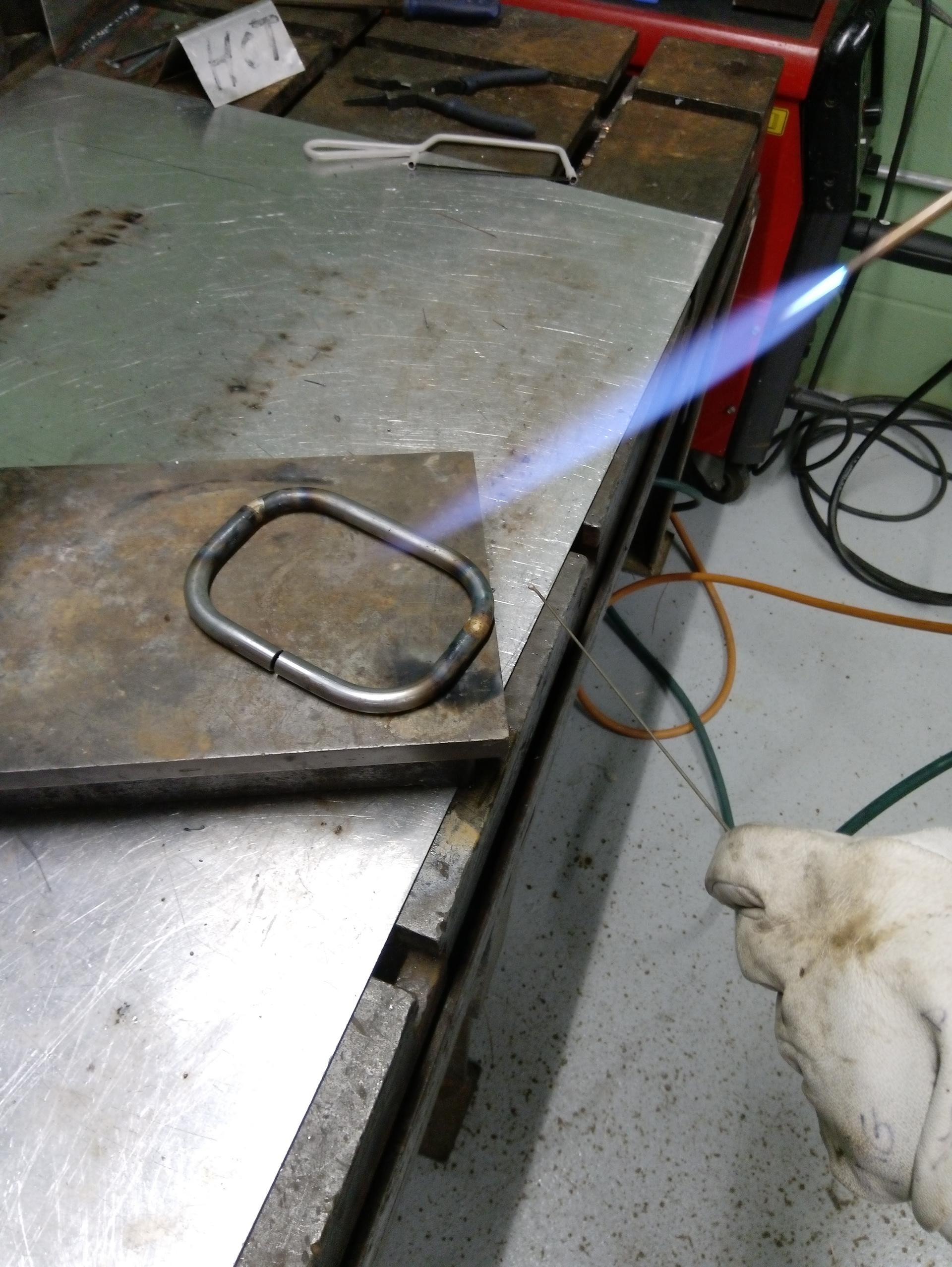
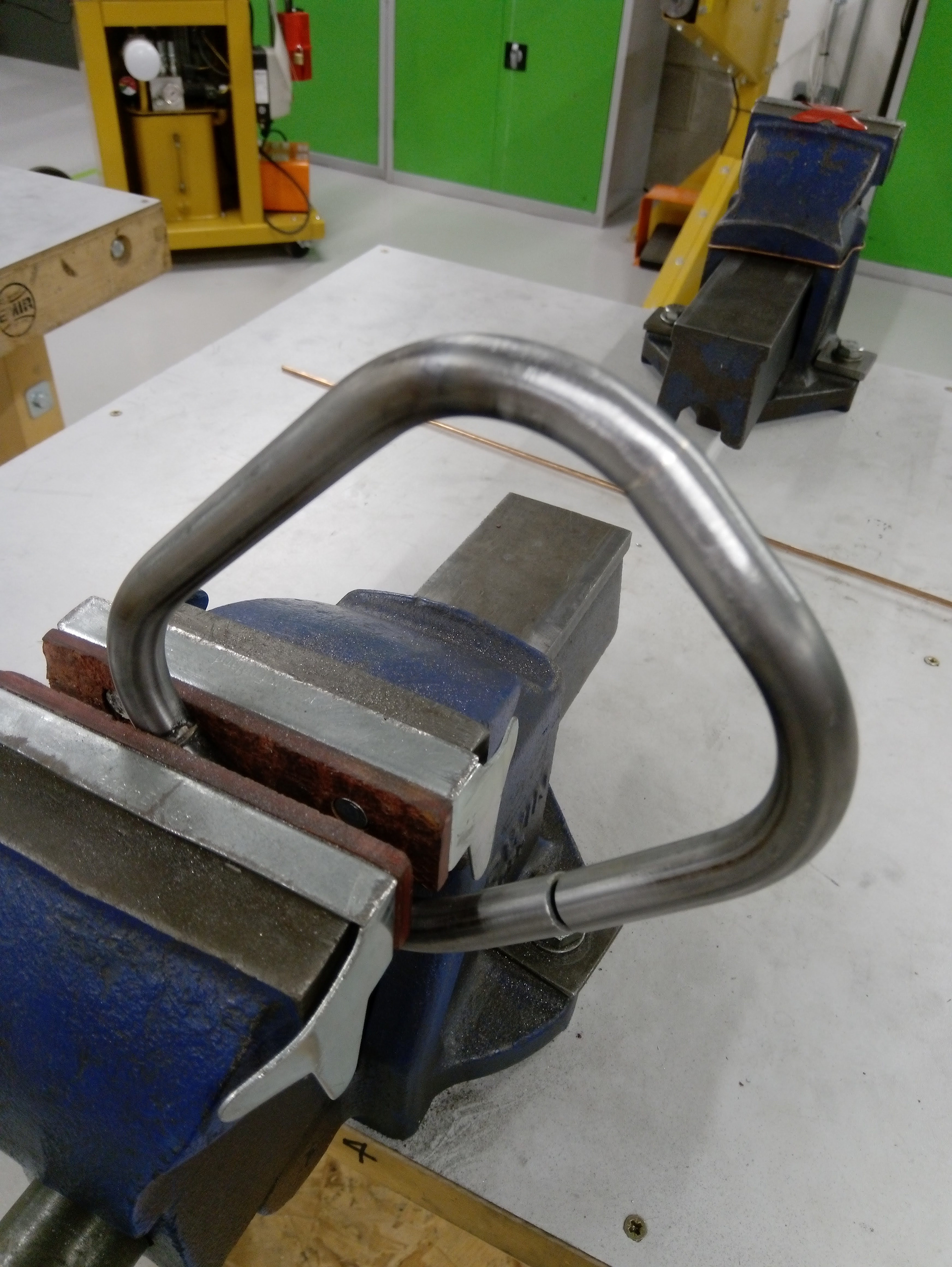
Workshop: Metalwork, woodwork

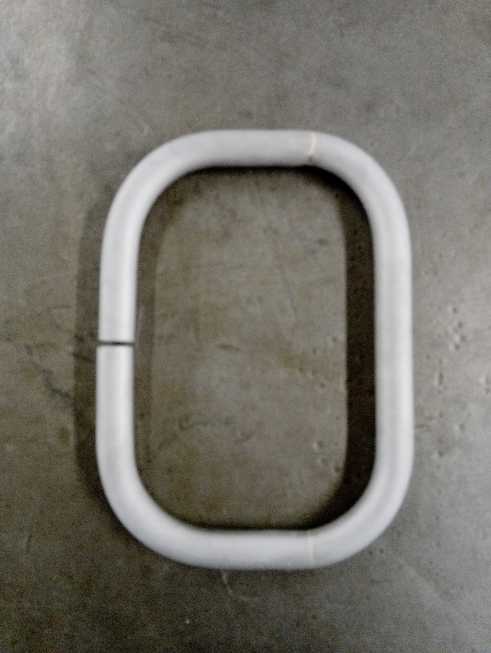
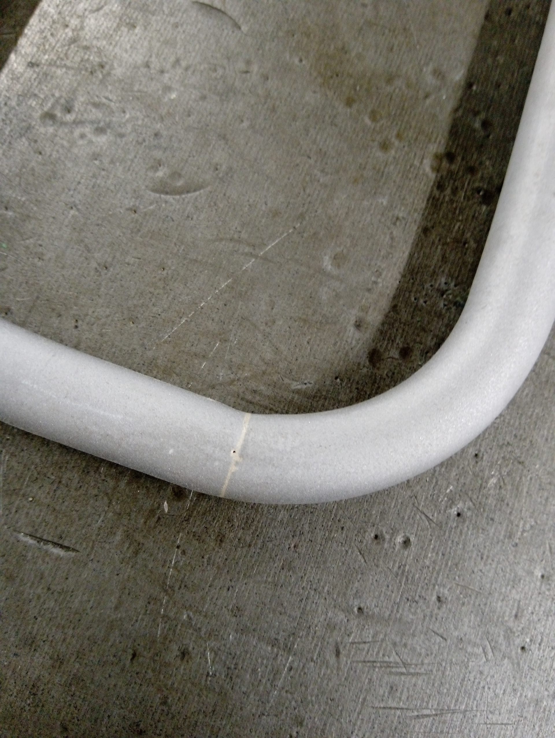
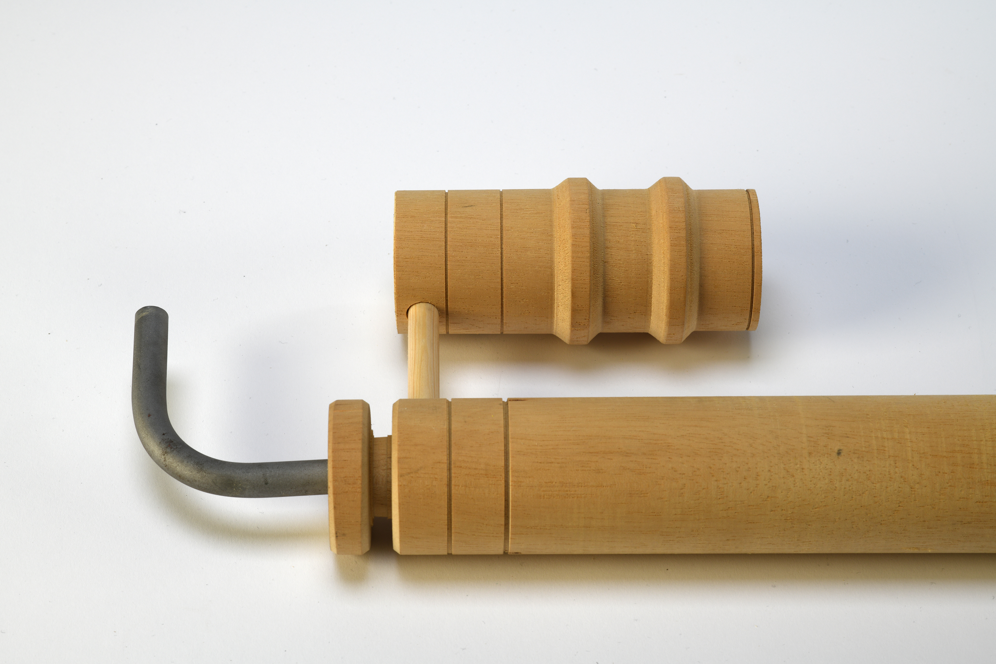

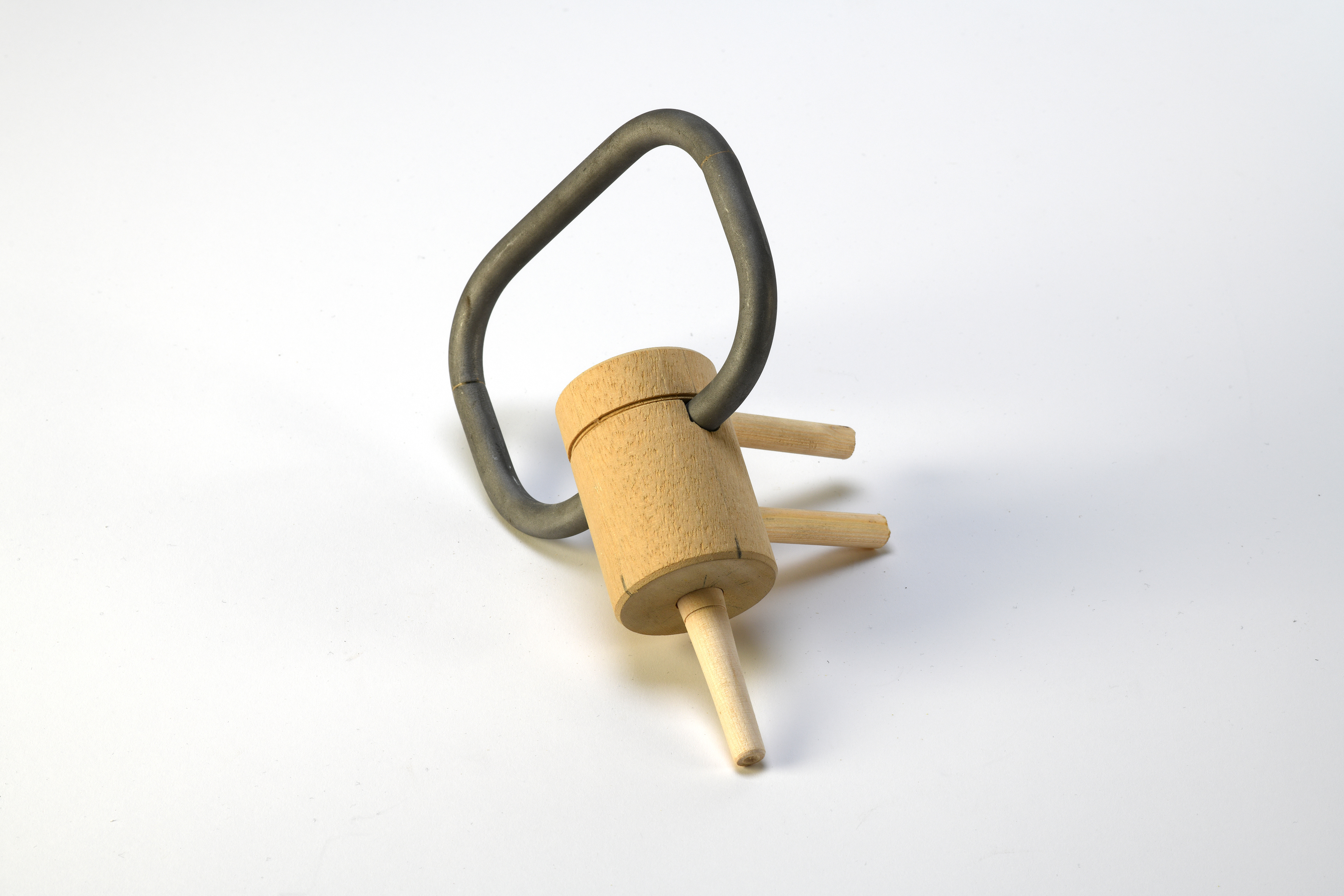
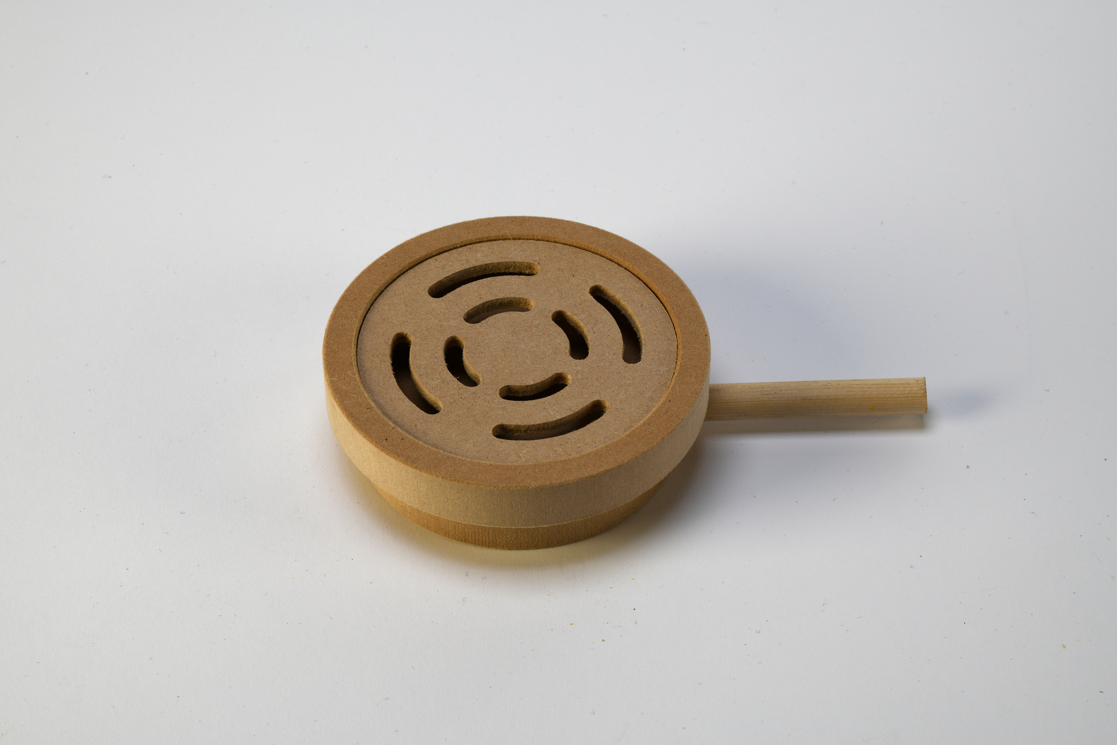

HELLS LAB Font
George Podoski 2021
Instagram: @georgepodoski
